Lexend has 9 styles and is a variable font. Lowercase and uppercase letters i, j, o, and q


Deutsche Version


Google Fonts partnered with CosmosDirekt, a German insurance company, to expand Lexend, a typeface designed by Dr. Bonnie Shaver-Troup for readers with dyslexia and other reading challenges. 

When Philipp Muhlebach, Executive Creative Director of Superunion in Germany, learned about Lexend, he made it the default font in his browser. The new typeface promised to help struggling readers with various spacing options that improved readability. He noticed that Lexend did help him read more quickly and fluently than other fonts. (Reading fluency consists of three components: accuracy, speed, and expression.) 

“I was impressed with Lexend’s mission. It improves reading performance by enhancing the legibility of the words with distinctive letters and numbers. It also combats the challenges faced by millions of people with dyslexia,” said Mühlebach. 

When CosmosDirekt hired Superunion, for a rebranding project, Mühlebach suggested CosmosDirekt use Lexend to reflect the company’s new modern look. He found that the typeface could aptly work for the various types of text the insurance company used: bold and confident banners and display text, and more subtle and serious content. “As Lexend was available through Google Fonts, we knew that it could generate the best performance across multiple digital devices,” said Mühlebach.


Mobile screen with images of a car and home, prices in Euros for car and home insurance

CosmosDirekt mobile applications for car and home insurance

CosmosDirekt wanted to make it easier for customers with reading difficulties to read and understand their materials. “We loved the font and the story behind it all. Insurance language is hard enough to understand. We’re trying to make it all as simple and accessible as possible,” said Jeromy Lohmann, Head of Marketing and Sales at CosmosDirekt.  


However, there was a problem. Lexend was only available as a single weight, Regular 400. CosmosDirekt needed more font weights for its documents, websites, and marketing materials. 


CosmosDirekt partnered with Google Fonts to commission Font Bureau and Superunion to expand Lexend from one to nine weights for the insurer to use in its products and for Google Fonts to offer for anyone to use without charge. The new weights (Thin, Extra Light, Light, Medium, SemiBold, Bold, ExtraBold, and Black) were published on Google Fonts in April 2021.


Since January 2022, CosmosDirekt has been using Lexend online in their website, app, forms, and advertising. The company is going to roll out Lexend in all future communication materials. “Overall our customers are extremely impressed with our new rebranding,” said Lohmann. 


Desktop page with an man in cap taking a picture with his phone while a dog licks his face CosmosDirekt desktop homepage page for animal insurance

For CosmosDirekt, increasing the amount of Lexend offerings wasn’t just about the company’s new look, it was also about social responsibility. “We quickly understood the added value we could offer many people who are faced with reading issues. What is better than using design to improve the lives of many?” stated Lohmann. 

Shaver-Troup sees the Lexend extension as a business model for solving major problems: “What this exceptional collaboration has done to eradicate reading issues will resonate far into the future. Reading problems are often described as a global crisis. However, we need to think about how reading impacts people on an individual level. Having Lexend available in nine font weights gives many individuals the choices they need to find the right font for them.” 

Lexend fonts are available on Google Fonts, in Google Docs and in Google Workspace. Watch this video to see how to add Lexend in Google Docs. To learn more about the creation of Lexend, visit Clean and clear: making reading easier with Lexend.

Posted by Susanna Zaraysky, Google Fonts Content Strategist

Lexend hat 9 verschiedene Stile und ist eine variable Schriftart. Hier zu sehen: Die Klein- und Großbuchstaben i, j, o und q.


Google Fonts arbeitet mit CosmosDirekt, einer deutschen Versicherungsgesellschaft zusammen, um Lexend, eine Schriftart, die von Dr. Bonnie Shaver-Troup für Leser mit Dyslexie und anderen Leseschwächen entwickelt wurde, weiter auszubauen. 

Als Philipp Mühlebach, Executive Creative Director bei Superunion in Deutschland, von Lexend erfuhr, legte er sie als standard Schriftart in seinem Browser fest. Die neue Schriftart versprach Nutzern mit eingeschränkten Lesefähigkeiten mithilfe von verschiedenen Abstandsoptionen eine bessere Lesbarkeit. Mühlebach stellte fest, dass Lexend ihm tatsächlich dabei half, schneller und flüssiger zu lesen als mit anderen Schriftarten. Die Leseflüssigkeit setzt sich aus drei Komponenten zusammen: Genauigkeit, Geschwindigkeit und Ausdruck. 


„Ich war von dem Anliegen von Lexend beeindruckt. Die Schriftart verbessert die Leseleistung, indem die Lesbarkeit der Wörter durch deutlich zu erkennende Buchstaben und Zahlen erhöht wird. Das Unternehmen kämpft auch gegen die Herausforderungen, denen sich Millionen von Menschen mit Dyslexie stellen müssen“, so Mühlebach. 


Als CosmosDirekt Superunion für ein Rebrandingprojekt engagierte, schlug Mühlebach CosmosDirekt vor, Lexend zu nutzen, um das neue moderne Design des Unternehmens widerzuspiegeln. Er stellte fest, dass die Schriftart gut für die verschiedenen Textarten geeignet wäre, die bei der Versicherungsgesellschaft verwendet werden: Banner und Displaytexte, die fett gedruckt sind und Vertrauen ausstrahlen, sowie dezentere und ernstere Inhalte. „Als Lexend über Google Fonts verfügbar war, wussten wir, dass diese Schriftart auf verschiedenen digitalen Geräten die beste Leistung generieren könnte“, sagte Mühlebach.


Display eines Mobilgeräts mit Bildern eines Autos und eines Hauses, Preise in Euro für Auto- und Wohngebäudeversicherungen

Mobile Anwendungen von CosmosDirekt für Auto- und Wohngebäudeversicherungen


CosmosDirekt wollte es Kunden mit Leseschwächen einfacher machen, ihre Informationen zu lesen und zu verstehen. „Uns hat die Schriftart und auch die Geschichte dahinter sehr gut gefallen. Versicherungssprache ist so schon schwer genug verständlich. Wir versuchen daher, alle Informationen so einfach und barrierefrei wie möglich zu gestalten“, sagte Jeromy Lohmann, Head of Marketing and Sales bei CosmosDirekt.


Es gab jedoch ein Problem. Lexend war nur mit einer Schriftstärke, nämlich „Regular 400“, verfügbar. CosmosDirekt brauchte jedoch mehr Schriftstärken für seine Dokumente, Websites und Marketingmaterialien. 


CosmosDirekt hat daher zusammen mit Google Fonts die Unternehmen Font Bureau und Superunion damit beauftragt, Lexend von einer auf neun Schriftstärken zu erweitern, sodass die Versicherungsgesellschaft diese in ihren Produkten nutzen und Google Fonts sie für alle Nutzer kostenlos anbieten kann. Die neuen Schriftstärken (Thin, Extra Light, Light, Medium, SemiBold, Bold, ExtraBold und Black) wurden im April 2021 bei Google Fonts veröffentlicht.


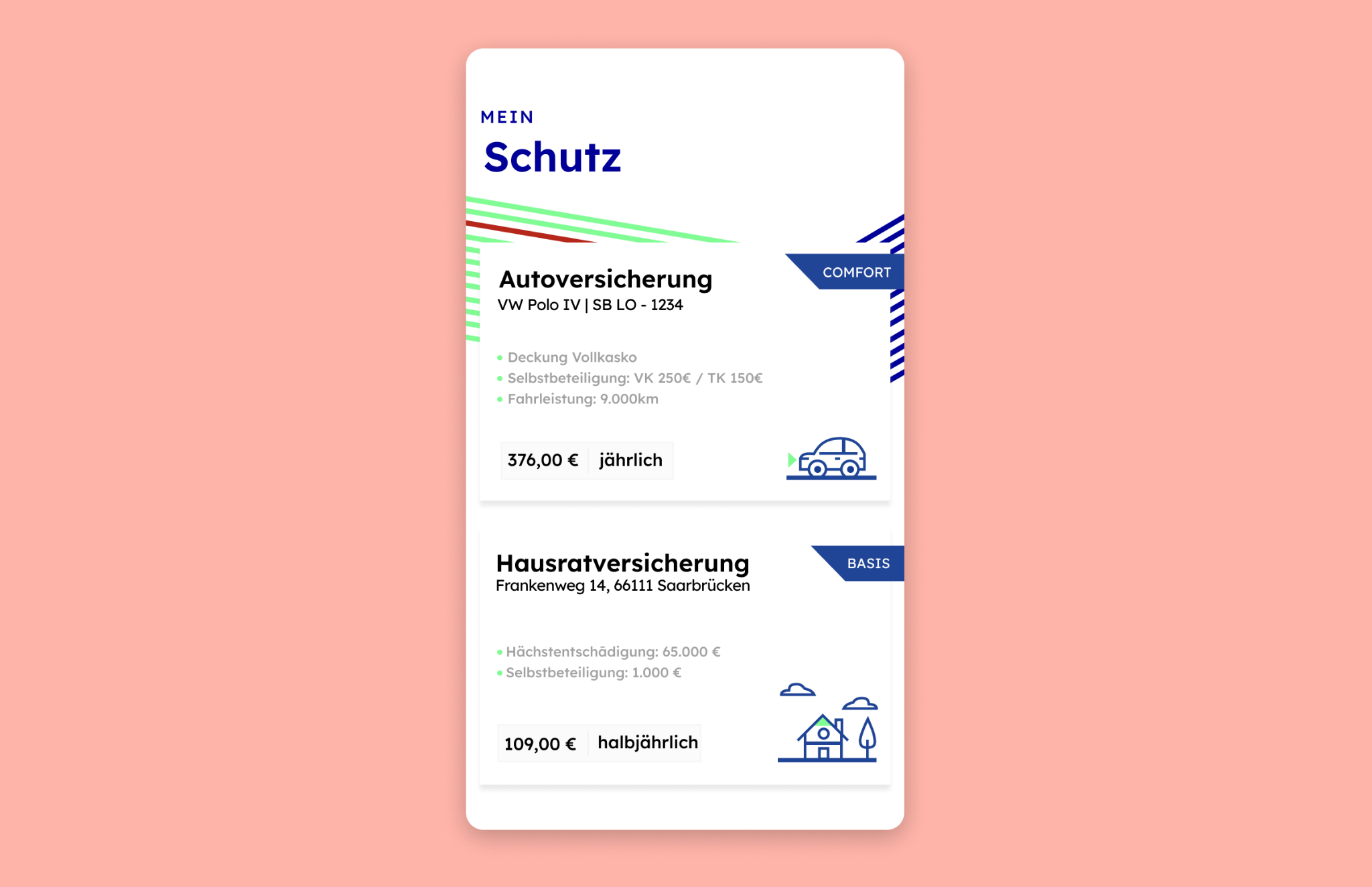
Seit Januar 2022 verwendet CosmosDirekt Lexend online auf der Website, in der App, in Formularen und in Werbung für das Unternehmen. Die Versicherungsgesellschaft möchte Lexend zukünftig in all ihren Kommunikationsmaterialien nutzen. „Insgesamt waren unsere Kunden äußerst beeindruckt von unserem neuen Rebranding“, sagte Lohmann. 


Seite auf einem Computer mit einem Mann mit einer Mütze, der ein Foto mit seinem Smartphone macht, während ein Hund sein Gesicht ableckt
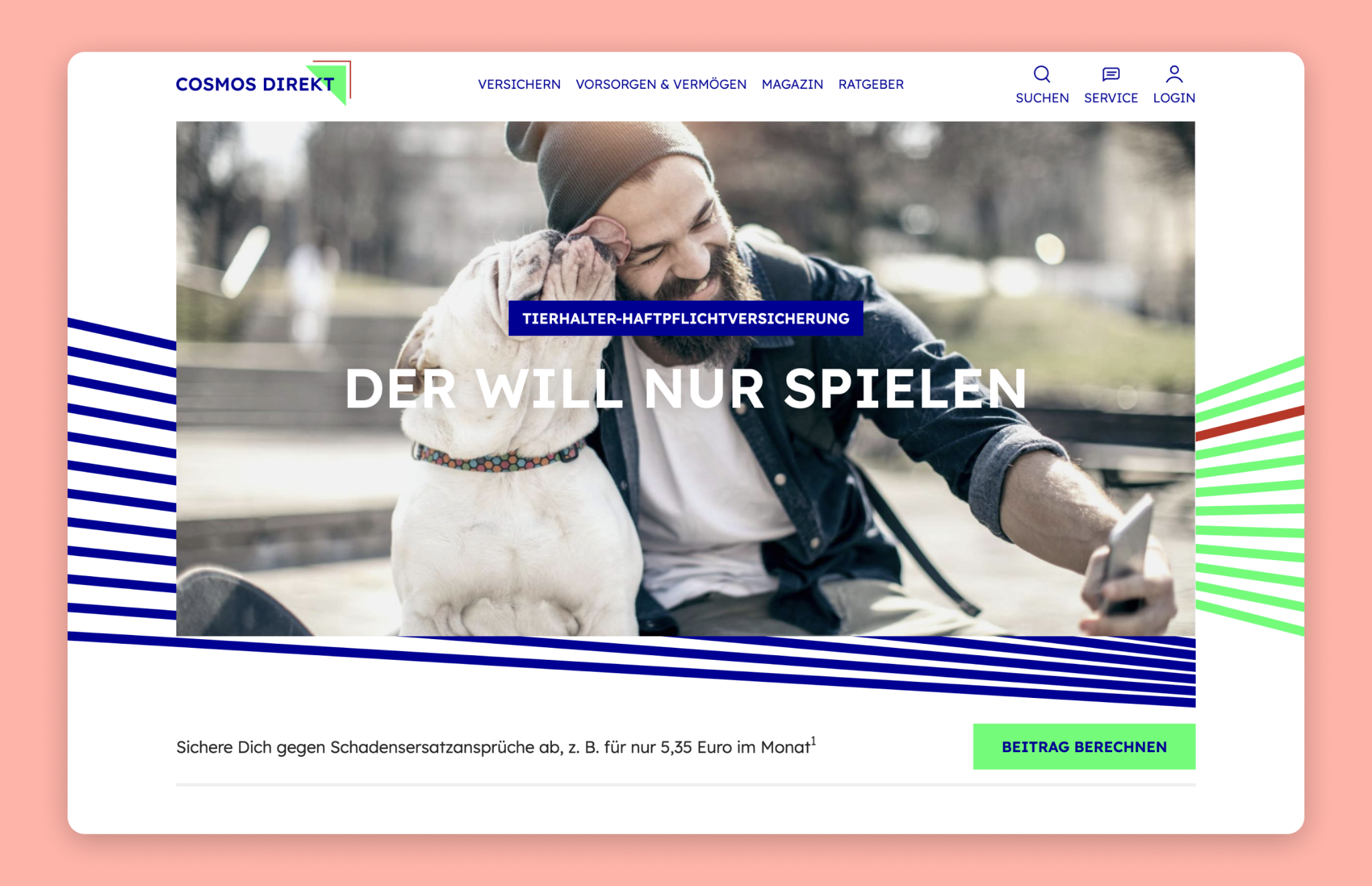
CosmosDirekt-Startseite auf einem Computer für eine Haustierversicherung


Für CosmosDirekt ging es bei der Erweiterung der Anzahl an Lexend-Angeboten nicht nur um das neue Erscheinungsbild des Unternehmens, sondern auch um soziale Verantwortung. „Wir haben schnell den Mehrwert erkannt, den wir vielen Menschen mit Leseproblemen bieten können. Was ist besser, als mithilfe von Design das Leben vieler Menschen zu verbessern?“, sagte Lohmann. 


Shaver-Troup sieht die Lexend-Erweiterung als Geschäftsmodell, das große Probleme löst: „Was diese außergewöhnliche Zusammenarbeit geschaffen hat, um Leseprobleme zu beseitigen, wird noch in Zukunft nachhallen. Leseprobleme werden oft als globale Krise beschrieben. Wir müssen uns jedoch darüber Gedanken machen, wie Lesen sich auf den einzelnen Menschen auswirkt. Dadurch, dass Lexend in neun Schriftstärken verfügbar ist, können Nutzer nun genau die Schrift finden, die zu ihren Bedürfnissen passt.“ 


Lexend-Schriftarten sind bei Google Fonts, in Google Docs und in Google Workspace verfügbar. In diesem Video erfährst du, wie du Lexend in Google Docs hinzufügst. Weitere Informationen zur Erstellung von Lexend findest du unter Clean and clear: making reading easier with Lexend.


Veröffentlicht von Susanna Zaraysky, Google Fonts Content Strategist